Portfolio .
Om Odyssey .
Om Odyssey is a yoga tour management company with operations in the US and India. The company's target market is adventurous, health focused women aged 25-50. Design specifications required the Om symbol but left all other creative aspects open to exploration.
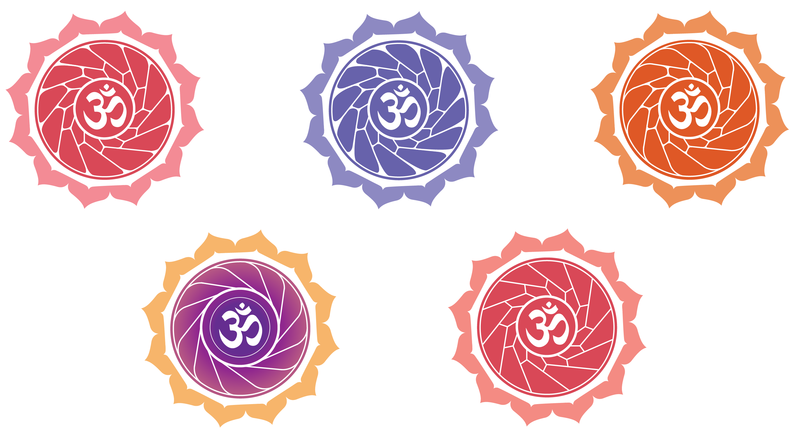
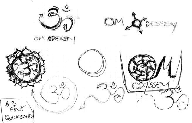
Cultural sensitivity was an important consideration in the design process. Ultimately we decided that altering the Om symbol could be misinterpreted and instead chose the mandala to enclose it. The mandala symbolizes wholeness and harmony within the universe, which we felt embodied the spiritual discovery yogis would experience on the tour.
Top to bottom: the final designs, color/line work options within the mandala, and initial sketches.


