Portfolio .
Homepage Concept .
This project was assigned when the Cobird stakeholders wanted to open up ideas for incorporating news, entertainment, shopping, and social media into one site. What could a home page look like where all four categories were of equal importance? In order to drastically clean up and simplify the experience, I took a literal approach and separated the four categories into four decks of cards with content changing automatically approximately every 5 seconds. On the top right, console tools are hidden within the gear icon, the shopping bag is easily accessible and location/weather info is readily viewed.
Category .
Animation .
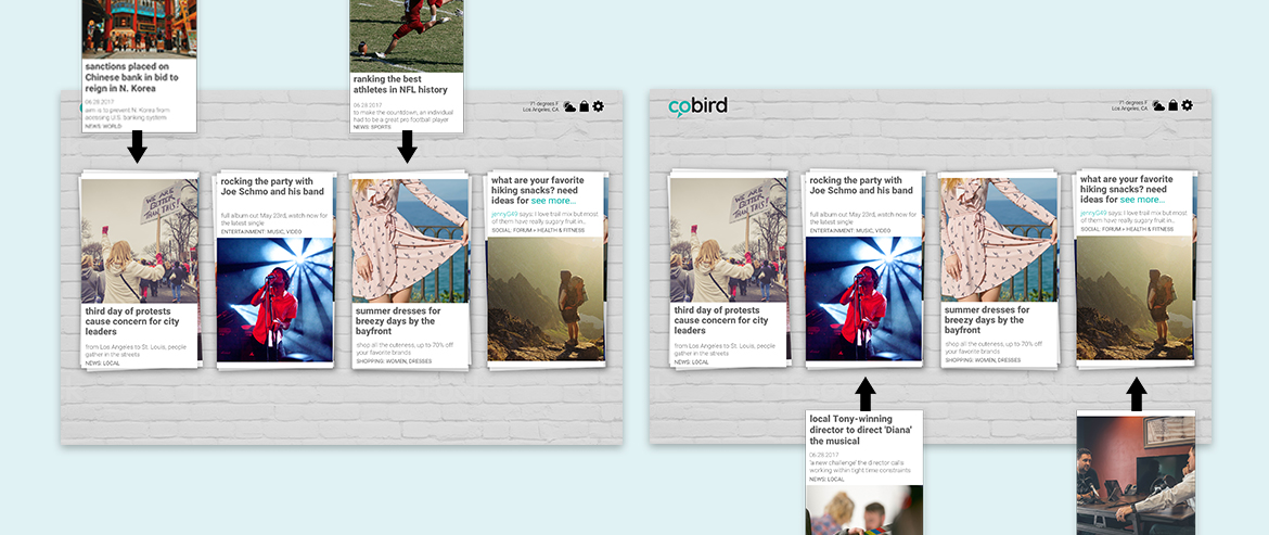
Animation is a key component to the style of this homepage. To push content through the stacks of cards, the cards would drop in two at a time on alternating stacks on regular intervals upon page load. Cards continue to stack with featured content at regular intervals until page is refreshed or cycle starts over.
Animation is a key component to the style of this homepage. To push content through the stacks of cards, the cards would drop in two at a time on alternating stacks on regular intervals upon page load. Cards continue to stack with featured content at regular intervals until page is refreshed or cycle starts over.
Content Categories .
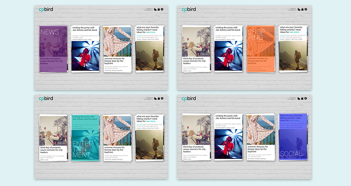
Each stack would contain content within the four categories. On hover, the categories would reveal as a transparent colored card. Mobile solutions were not included in the scope of this exercise.
Each stack would contain content within the four categories. On hover, the categories would reveal as a transparent colored card. Mobile solutions were not included in the scope of this exercise.
Console & Content Section.
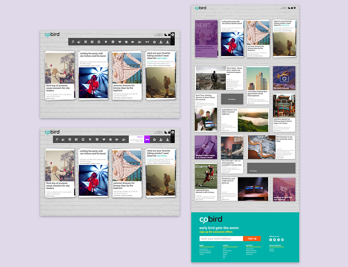
The console included most of the tools specified in the e-commerce iteration of Cobird, with a few redundancies eliminated. The console would reveal on hover or click of the gear icon, and the icon’s function would appear on hover in horizontal accordion fashion. On the right, the clicked state of the news category. Cards reveal below with "expand to grid” animation.
The console included most of the tools specified in the e-commerce iteration of Cobird, with a few redundancies eliminated. The console would reveal on hover or click of the gear icon, and the icon’s function would appear on hover in horizontal accordion fashion. On the right, the clicked state of the news category. Cards reveal below with "expand to grid” animation.


