Portfolio .
Cobird Beta .
Cobird is a stealth media startup that fuses content, social media and e-commerce into a seamless experience for millenials.
Category .
Process .
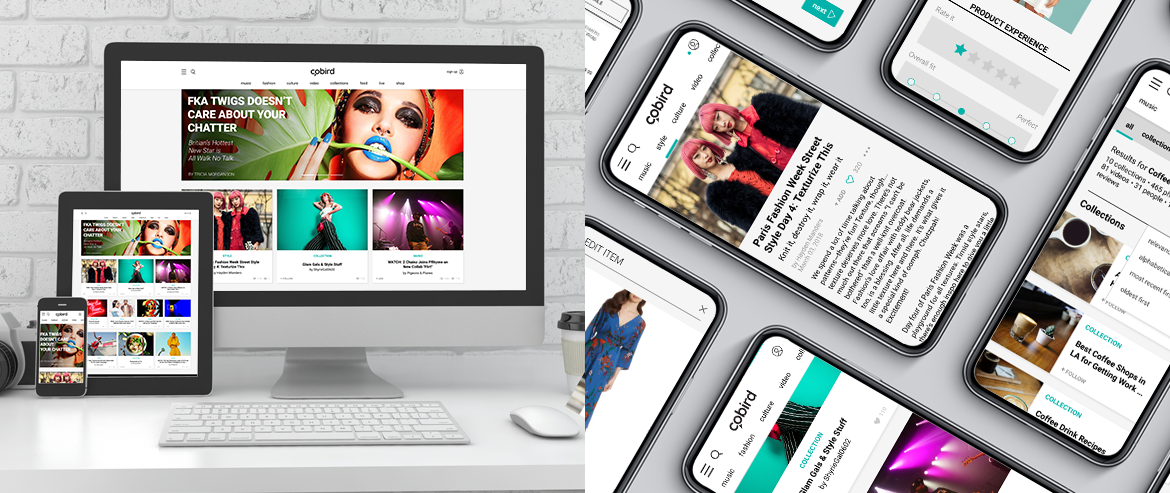
The design process began with gathering requirements from stakeholders and market research of top players in the categories we sought to incorporate in our experience. Inclusion of the 4 Platform Pillars were specified: a social engine, livestream events, media/content and e-commerce. The solution allows for both content and products to be shared in multiple ways across the site. Users can save Cobird curated content or products to a collection or share it to the feed, upload their own photos or videos, share external website links and interact with other Cobird users. This was to fulfill the ultimate business goal of user engagement.
The design process began with gathering requirements from stakeholders and market research of top players in the categories we sought to incorporate in our experience. Inclusion of the 4 Platform Pillars were specified: a social engine, livestream events, media/content and e-commerce. The solution allows for both content and products to be shared in multiple ways across the site. Users can save Cobird curated content or products to a collection or share it to the feed, upload their own photos or videos, share external website links and interact with other Cobird users. This was to fulfill the ultimate business goal of user engagement.
Interaction Design .
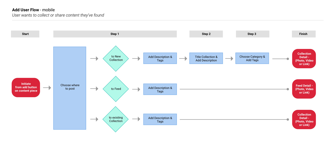
User flows were created to visualize steps of certain processes and assist in communicating with developers. Above details design of the user experience for uploading new content and sharing existing content, which required consideration of requirements specific to desktop and mobile devices.
User flows were created to visualize steps of certain processes and assist in communicating with developers. Above details design of the user experience for uploading new content and sharing existing content, which required consideration of requirements specific to desktop and mobile devices.
Wireframes .
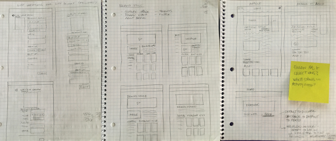
Due to a condensed time frame, sketched wireframes were done before moving into more complete designs. Above, options explored for the Write a Review UI, iterations of a brand’s page in the Marketplace, and layout of article pages.
Due to a condensed time frame, sketched wireframes were done before moving into more complete designs. Above, options explored for the Write a Review UI, iterations of a brand’s page in the Marketplace, and layout of article pages.
Final Pages.
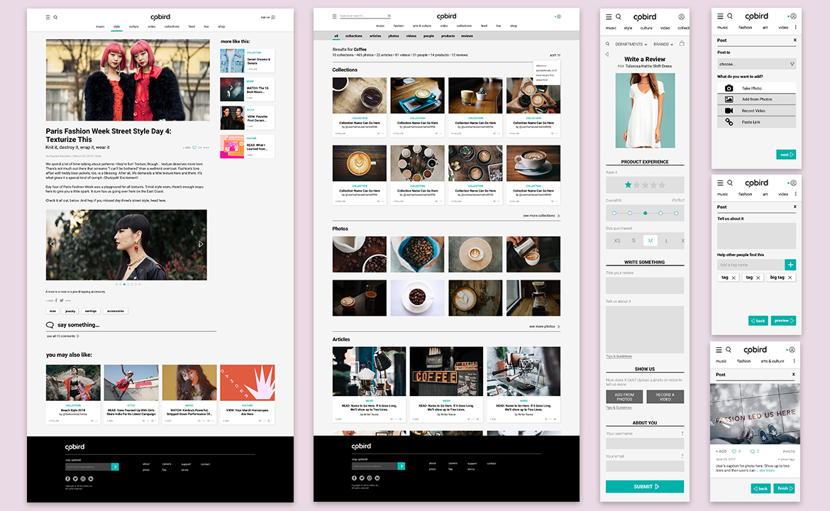
The design was kept clean and minimal to allow content to shine. Use of card-based UI throughout the site allowed multiple types of media to reside together in a quickly digestible format. From a top-level view of each card, users could add the content to a collection or feed post, or follow a collection. Search results displayed with sub-navigation to allow users to view results by content type. Forms and processes were kept simple and divided up with bold headings and bright teal CTA buttons to guide users. Page backgrounds were soft gray to reduce eye strain and provide a neutral palette for bold images.
The design was kept clean and minimal to allow content to shine. Use of card-based UI throughout the site allowed multiple types of media to reside together in a quickly digestible format. From a top-level view of each card, users could add the content to a collection or feed post, or follow a collection. Search results displayed with sub-navigation to allow users to view results by content type. Forms and processes were kept simple and divided up with bold headings and bright teal CTA buttons to guide users. Page backgrounds were soft gray to reduce eye strain and provide a neutral palette for bold images.


