Portfolio .
Process .
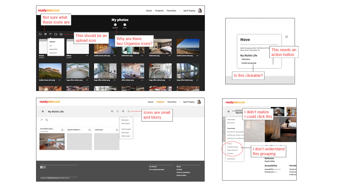
When I joined the team at Ready Set Scout, usability testing revealed that users were unclear on how to search effectively, use the site to collaborate, and share what they’ve found. Existing UI was inconsistent, icons were confusing, the mobile experience was not optimized and process flows were missing steps. Users requested features to enhance their privacy and control within the collaboration environment.
When I joined the team at Ready Set Scout, usability testing revealed that users were unclear on how to search effectively, use the site to collaborate, and share what they’ve found. Existing UI was inconsistent, icons were confusing, the mobile experience was not optimized and process flows were missing steps. Users requested features to enhance their privacy and control within the collaboration environment.
User Interviews.
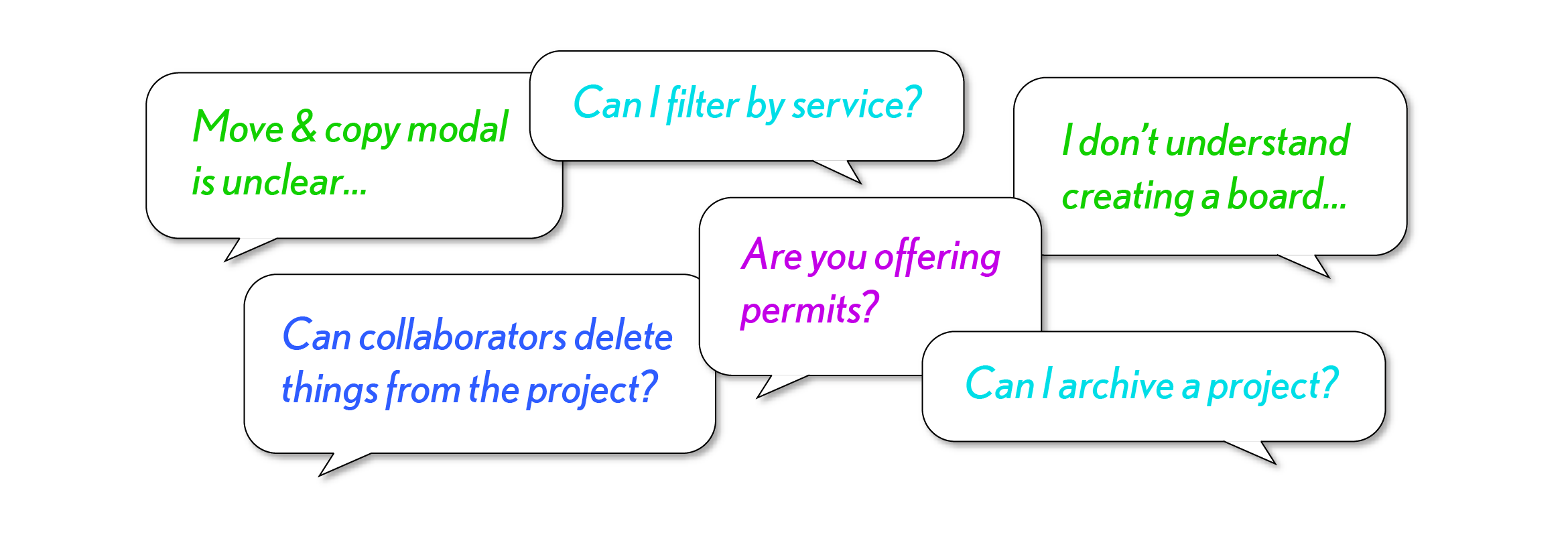
User feedback was collected throughout the process. Previously feedback had been collected informally and features constructed by request. When I joined the team, I wrote a usability testing plan, implemented feedback collection tools, generated surveys, and conducted one on one observation sessions. I collected and organized the feedback to help the team prioritize feature implementation.
User feedback was collected throughout the process. Previously feedback had been collected informally and features constructed by request. When I joined the team, I wrote a usability testing plan, implemented feedback collection tools, generated surveys, and conducted one on one observation sessions. I collected and organized the feedback to help the team prioritize feature implementation.
User Flows .
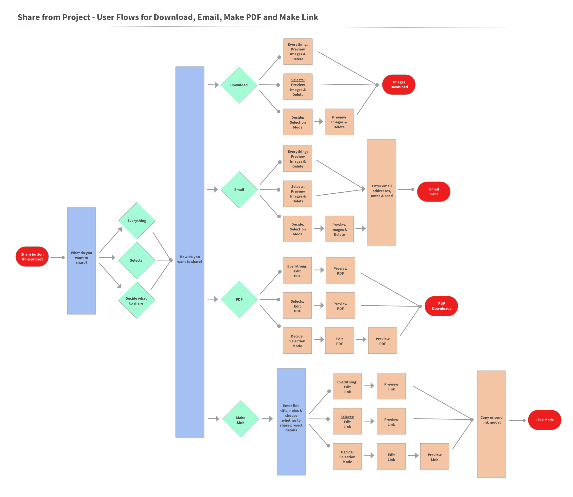
Some of the processes we designed had many different paths and possible outcomes. One such process was our share function. We allowed users to share location photos in several different areas of the site in order to speed communication and collaboration. We offered sharing by creating a custom link, downloading images, emailing images or creating a PDF. I constructed this user flow to help the team visualize the process.
Some of the processes we designed had many different paths and possible outcomes. One such process was our share function. We allowed users to share location photos in several different areas of the site in order to speed communication and collaboration. We offered sharing by creating a custom link, downloading images, emailing images or creating a PDF. I constructed this user flow to help the team visualize the process.
Wireframes.
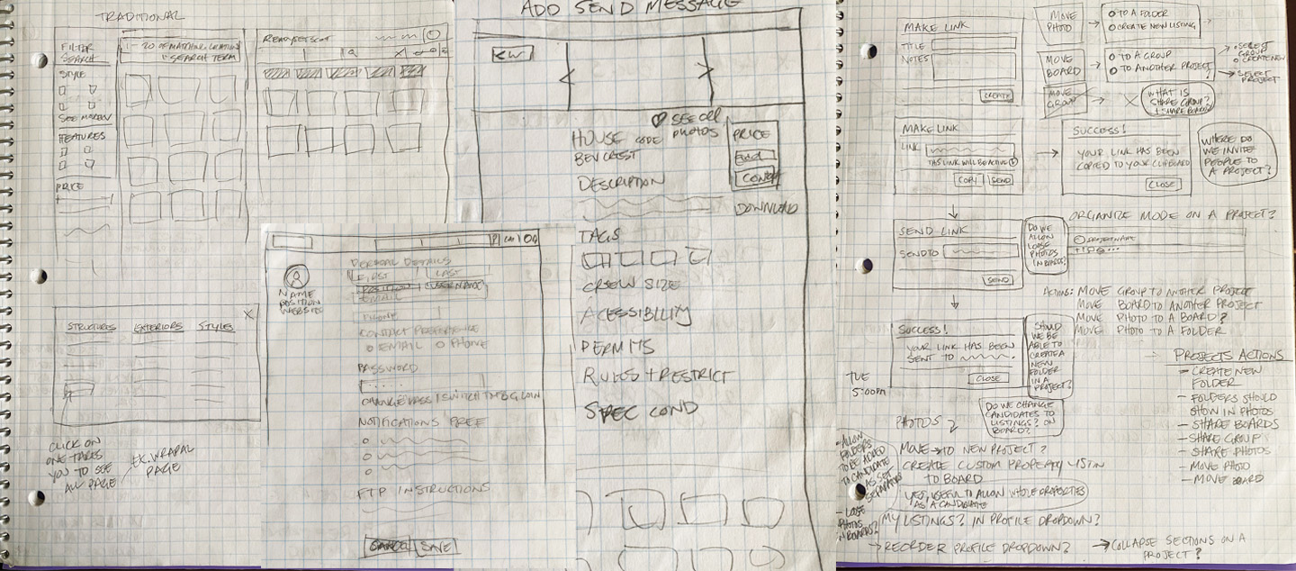
Wireframes were sketched before more complete mockups were created. Above, wireframes for the location page, search results, and profile page as well as process exploration for the Share function.Wireframes were sketched before more complete mockups were created. Above, wireframes for the location page, search results, and profile page as well as process exploration for the Share function.
Wireframes were sketched before more complete mockups were created. Above, wireframes for the location page, search results, and profile page as well as process exploration for the Share function.Wireframes were sketched before more complete mockups were created. Above, wireframes for the location page, search results, and profile page as well as process exploration for the Share function.
Iteration.
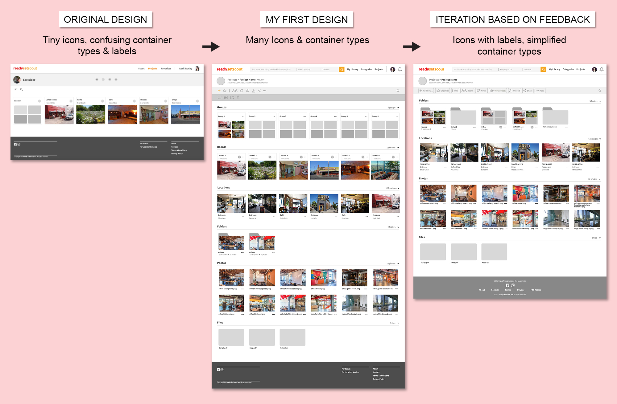
As I got to know our users better, I found they were very busy and had little bandwidth to learn new terms and processes. They needed simplicity and clarity to accomplish their tasks as quickly as possible with the most minimal learning curve. I found that an exploratory approach to learning - hovering and seeing a tooltip - did not work for this user group. I decided to clearly label what the icons did. I also found that a simpler container system could offer the same amount of flexibility with the benefit of more clarity. Our users were unsure how or why to create groups or boards, but they found that folders were more familiar and useful organizational tools.
As I got to know our users better, I found they were very busy and had little bandwidth to learn new terms and processes. They needed simplicity and clarity to accomplish their tasks as quickly as possible with the most minimal learning curve. I found that an exploratory approach to learning - hovering and seeing a tooltip - did not work for this user group. I decided to clearly label what the icons did. I also found that a simpler container system could offer the same amount of flexibility with the benefit of more clarity. Our users were unsure how or why to create groups or boards, but they found that folders were more familiar and useful organizational tools.
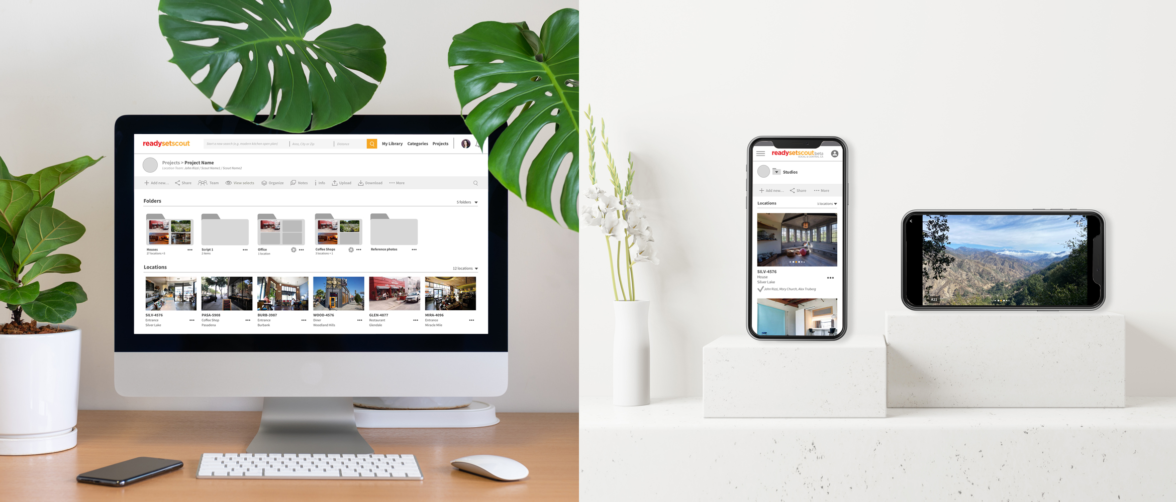
The design aesthetic was kept simple to highlight the location photos and encourage the user to fill the blank slate with ideas for their project.


