Portfolio .
No Film School .
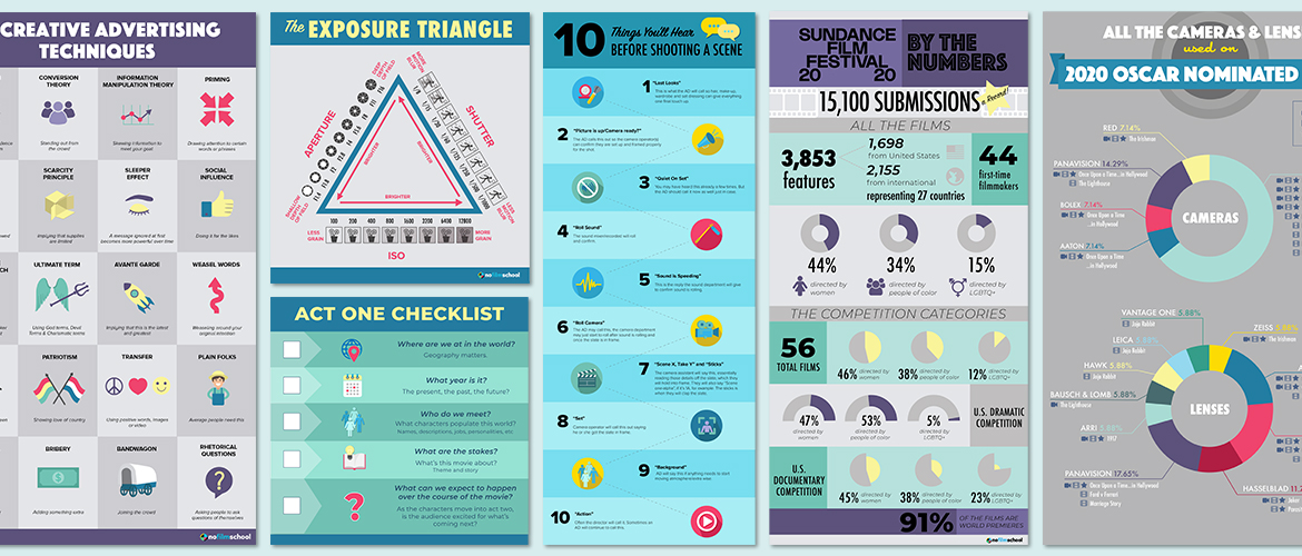
As the web designer for No Film School I performed a variety of digital design tasks such as creating infographics, web banners, images and headers for posts as well as UI design.
Category .
Web Graphics .
Above, post headers and below, infographics designed to attract readers and boost time on page metrics.
Above, post headers and below, infographics designed to attract readers and boost time on page metrics.
Over the course of my time at No Film school, I evolved the design aesthetic from very bright colors and gradients to subdued backgrounds with bright accents and more flat design. With no established brand guidelines for design, I had to work to unify the look based on occasional feedback from the CEO. We determined that the look had to be professional but fun and eye catching to grab a reader’s attention.
UI Design .
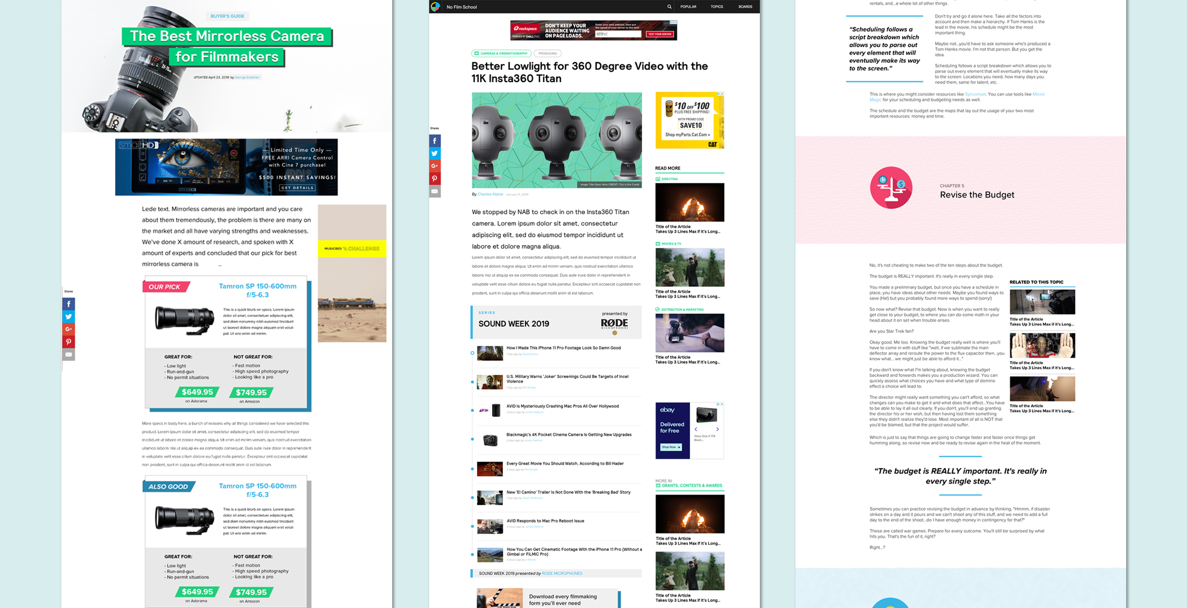
When I joined the team, the site design had not been updated since 2014. We felt the need to boost brand credibility with a more current design language, one that reflected a site with a loyal readership since 2005. Concerns with site navigation, bounce rate and a need for a longer post template were issues we focused on with the design. Unfortunately due to budget constraints with our development consultancy we were only able to launch the post page design.
When I joined the team, the site design had not been updated since 2014. We felt the need to boost brand credibility with a more current design language, one that reflected a site with a loyal readership since 2005. Concerns with site navigation, bounce rate and a need for a longer post template were issues we focused on with the design. Unfortunately due to budget constraints with our development consultancy we were only able to launch the post page design.
Designs were created for other pages to be implemented as budget allowed. Above, a template for a Gear Guide, a post linking a series of articles, and a feature post.


