Portfolio .
Cobird News Logo .
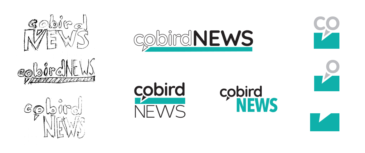
Cobird News was a source of edgy, progressive content relevant to millennials. The Cobird News logo design specifications included use of the original Cobird logo as well as the Cobird Teal color. I envisioned the beak as a tool for digging into the story, an illustration of a news team’s intent of uncovering the truth. The team decided that slight alteration of the original logo was acceptable in this instance, giving the impression of the beak without the literal representation of it.
Category .
Initial Ideation .
My initial ideation of the logo and bug included use of the Cobird logo in it’s original state. I played with contrast, using the lowercase letters of “Cobird" against all uppercase letters of “news”.
My initial ideation of the logo and bug included use of the Cobird logo in it’s original state. I played with contrast, using the lowercase letters of “Cobird" against all uppercase letters of “news”.
Design Development .
Stakeholders asked for exploration of the “news” type in lowercase as well, so I searched for fonts that would retain a solid contrast against the existing Cobird logo. It was agreed that the block could suggest the beak in the original logo, which proved to be a cleaner option than displaying the actual beak. Bug options were explored with and without representation of the word Cobird.
Stakeholders asked for exploration of the “news” type in lowercase as well, so I searched for fonts that would retain a solid contrast against the existing Cobird logo. It was agreed that the block could suggest the beak in the original logo, which proved to be a cleaner option than displaying the actual beak. Bug options were explored with and without representation of the word Cobird.
Final Designs.
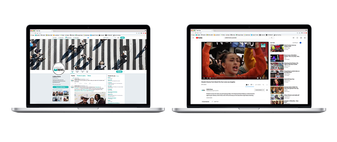
Tight turnaround was requested and final logo design and bug design was achieved in 1.5 days. The clean and bold designs worked well for their usage in social media and video.
Tight turnaround was requested and final logo design and bug design was achieved in 1.5 days. The clean and bold designs worked well for their usage in social media and video.


