Portfolio .
Cobird E-commerce .
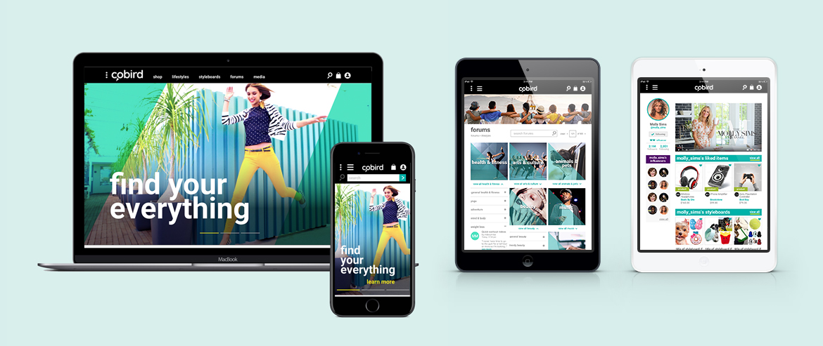
In its early phase, Cobird set out to become an e-commerce site for millennials with expanded social functionality. With the UX specifications complete, a team of 5 designers including myself created the UI design, visual design and company branding.
Category .
Home Page & Product Detail .
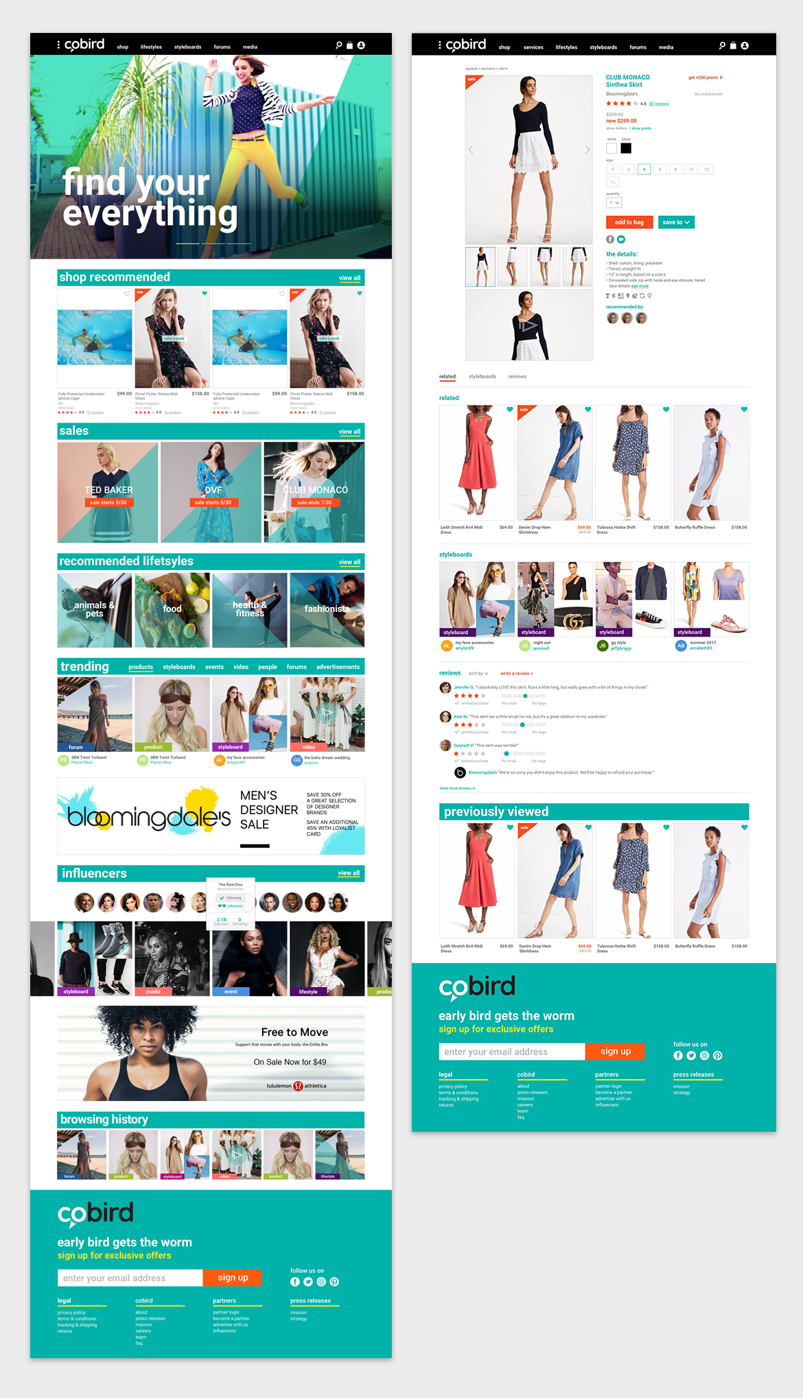
Big, bold headings separate sections of products from ads and social features. Color-coded tags separate types of content. CTA buttons are bright orange to attract the eye. Product Detail features clean layout with bold teal headings to make information quickly digestible. Add to Bag button is placed “above the fold” to increase conversions.
Big, bold headings separate sections of products from ads and social features. Color-coded tags separate types of content. CTA buttons are bright orange to attract the eye. Product Detail features clean layout with bold teal headings to make information quickly digestible. Add to Bag button is placed “above the fold” to increase conversions.
Forums .
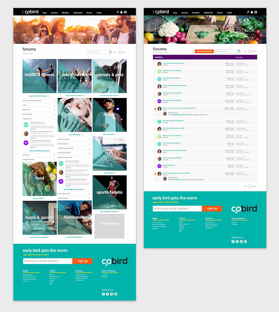
Forums were designed as a place for members to create conversations pertaining to selected interest categories. One the left, large image blocks with bold text organized top-level categories, a click to the teal “view all” text would expand an accordion menu of sub-categories. Sub-categories would reveal 3 top conversations with a link to “view all” conversations. On the right, all of a sub-categories' conversations in list view, with icons to indicate “hot” conversations that are currently getting many responses.
Forums were designed as a place for members to create conversations pertaining to selected interest categories. One the left, large image blocks with bold text organized top-level categories, a click to the teal “view all” text would expand an accordion menu of sub-categories. Sub-categories would reveal 3 top conversations with a link to “view all” conversations. On the right, all of a sub-categories' conversations in list view, with icons to indicate “hot” conversations that are currently getting many responses.
Profiles.
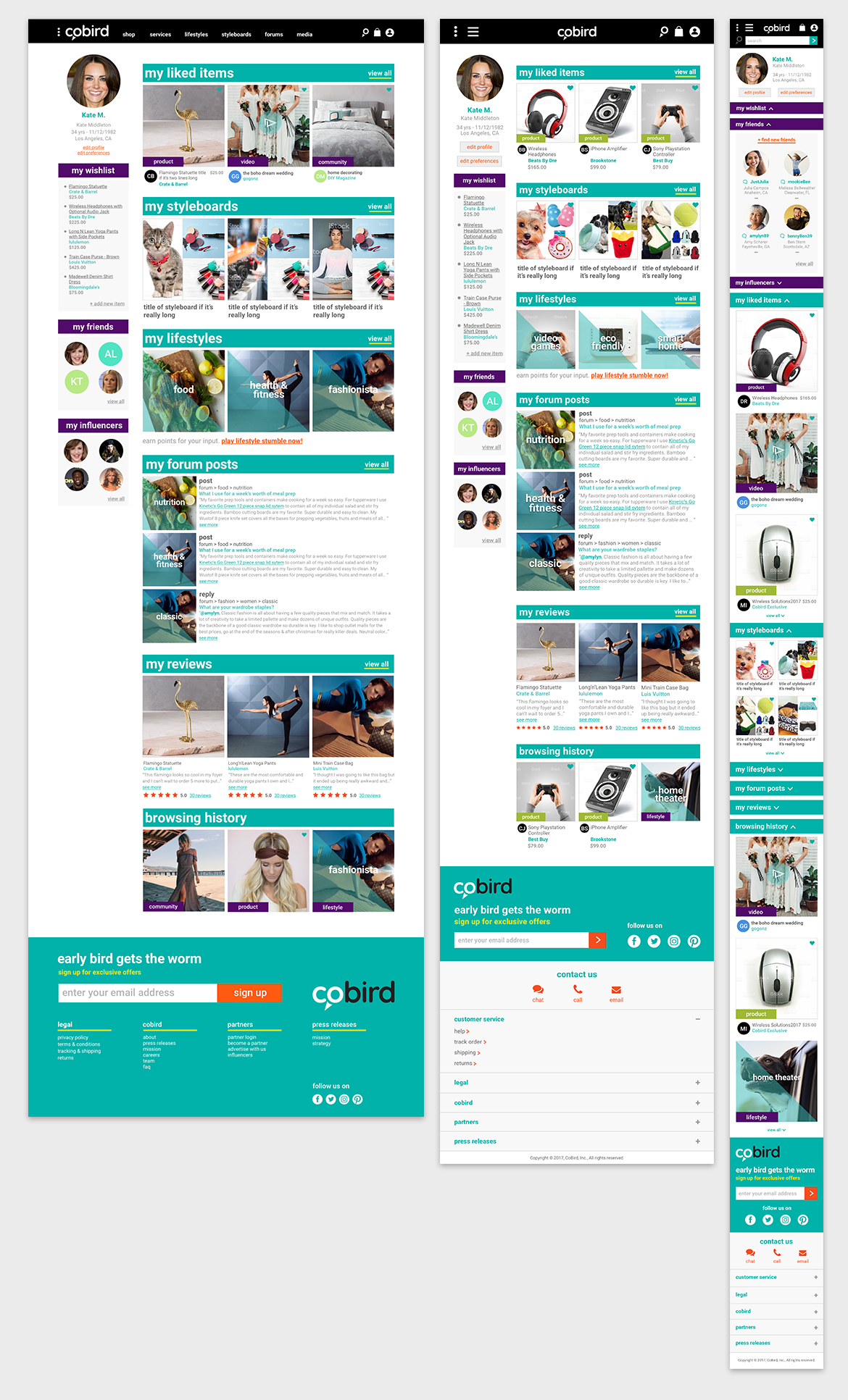
Above, sample of a users’ own profile in desktop, tablet and mobile. Users could view their wishlists, friends and followed influencers in a separate column from other site activity. On the right, a snapshot of the user’s activity on the site was broken into categories with bold headings to separate. Each category featured information in an visual arrangement similar or identical to its layout elsewhere on the site to maintain familiarity. Profiles for influencers and brands were similar with the addition of a video player at the top and fewer categories of information.
Above, sample of a users’ own profile in desktop, tablet and mobile. Users could view their wishlists, friends and followed influencers in a separate column from other site activity. On the right, a snapshot of the user’s activity on the site was broken into categories with bold headings to separate. Each category featured information in an visual arrangement similar or identical to its layout elsewhere on the site to maintain familiarity. Profiles for influencers and brands were similar with the addition of a video player at the top and fewer categories of information.


