Portfolio .
Cobird Alpha .
Cobird Alpha was a social experience for millennials centered around the curation and sharing of content in collections.
Category .
Process .
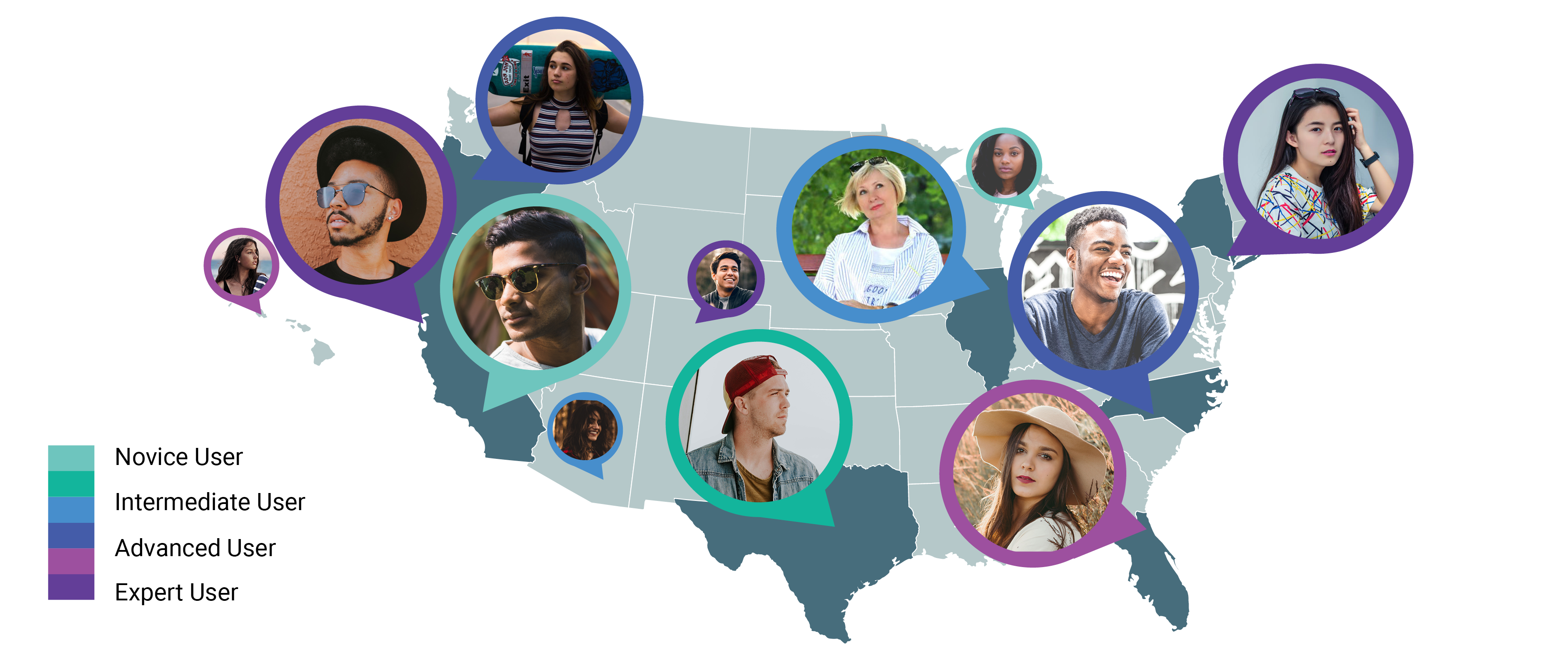
The design process began with examination of the millennial target market and creation of personas. Personas were divided into novice users, intermediate, advanced and expert users to help inspire and validate potential features. Requirements were gathered from stakeholders and user stories were written to generate possible scenarios to be wireframed.
The design process began with examination of the millennial target market and creation of personas. Personas were divided into novice users, intermediate, advanced and expert users to help inspire and validate potential features. Requirements were gathered from stakeholders and user stories were written to generate possible scenarios to be wireframed.
Information Architecture .
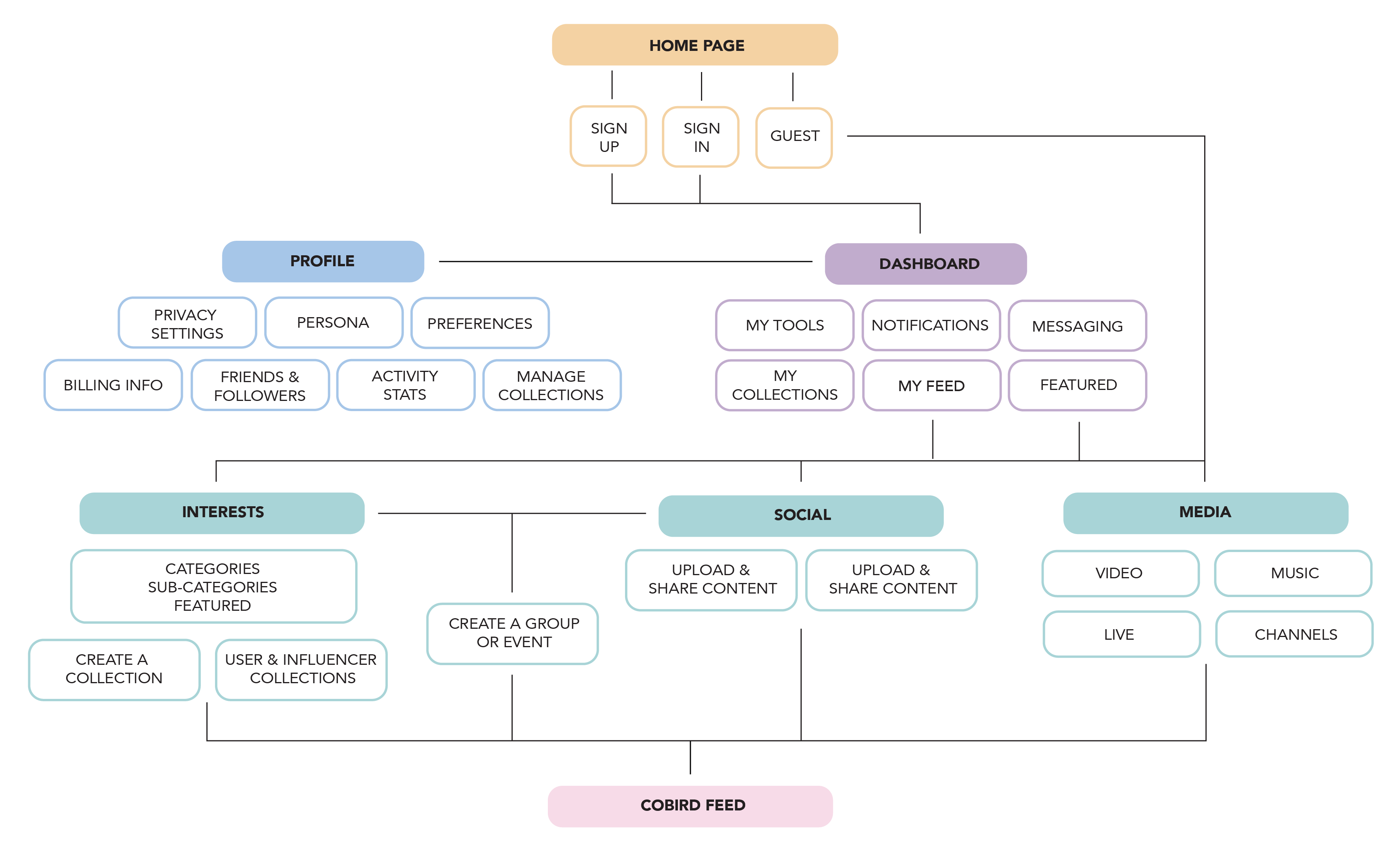
Sharing content and connecting people via interests were primary goals of the site. We divided up the main interaction areas into places one could discover content and places one could share content and connect with each other. Users could create groups or events related to interests or purely for social reasons. Each user had a dashboard where they could use tools, or view their messages, notifications or collections. The dashboard also featured a feed of interests, collections or people they were following.
Sharing content and connecting people via interests were primary goals of the site. We divided up the main interaction areas into places one could discover content and places one could share content and connect with each other. Users could create groups or events related to interests or purely for social reasons. Each user had a dashboard where they could use tools, or view their messages, notifications or collections. The dashboard also featured a feed of interests, collections or people they were following.
Lo-fi Wireframes.
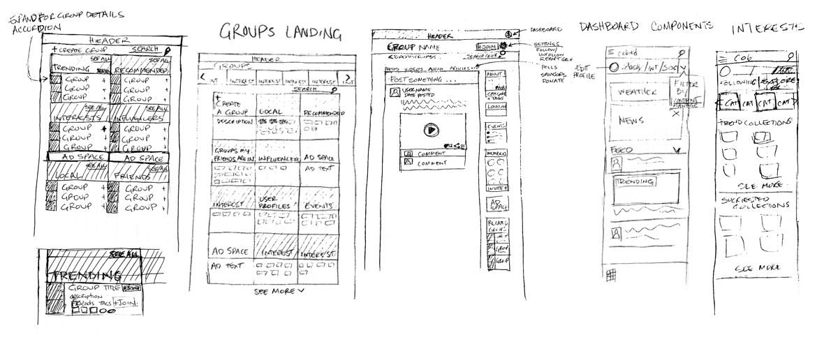
Possible page layouts were loosely sketched before more refined wireframes were created. Above, sketches for a groups landing page, a group detail page, mobile view of the dashboard and discover interests page.
Possible page layouts were loosely sketched before more refined wireframes were created. Above, sketches for a groups landing page, a group detail page, mobile view of the dashboard and discover interests page.
Hi-fi Wireframes .
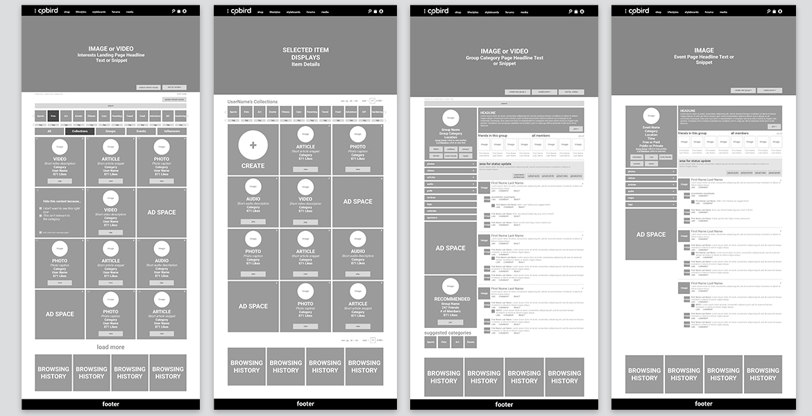
Two sets of high fidelity wireframes were done to envision possible scenarios. The “simple” ones kept features at an MVP level, the “complicated” ones fleshed out a full featured experience. Above, wireframes for a “complicated” interests landing page, a “simple” collection page, a “complicated” group detail page and a “simple” event detail page.
Two sets of high fidelity wireframes were done to envision possible scenarios. The “simple” ones kept features at an MVP level, the “complicated” ones fleshed out a full featured experience. Above, wireframes for a “complicated” interests landing page, a “simple” collection page, a “complicated” group detail page and a “simple” event detail page.
Final Designs .
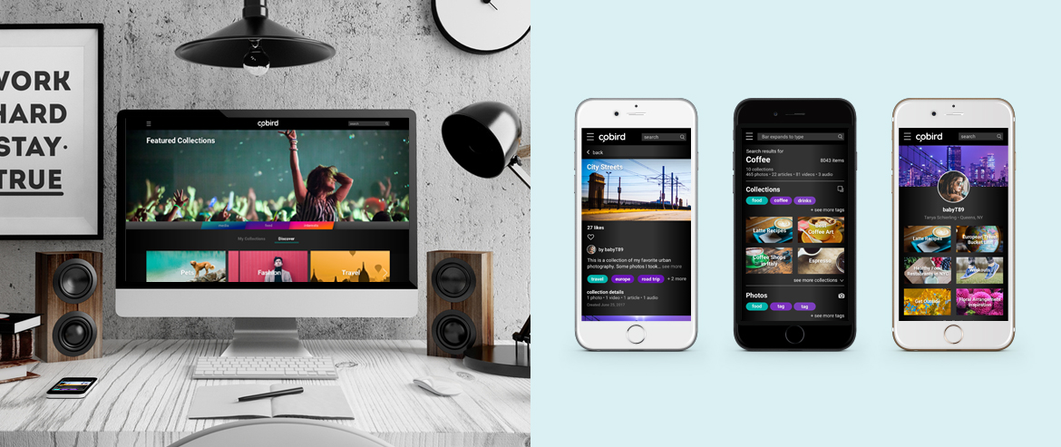
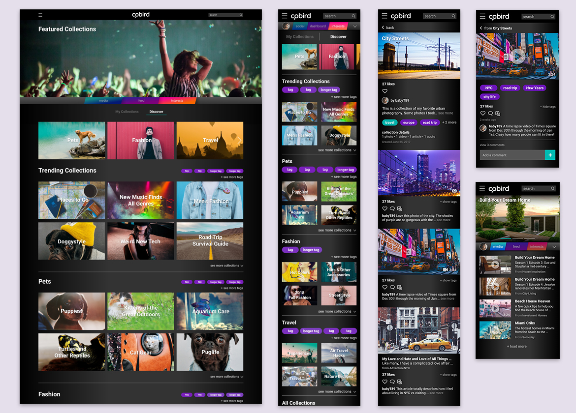
The final alpha site was designed mobile-first and condensed the experience to focus on exploring interests via collections and the media feed. The profile was kept simple for the initial launch with the intention of fleshing out the dashboard in future iterations.
The final alpha site was designed mobile-first and condensed the experience to focus on exploring interests via collections and the media feed. The profile was kept simple for the initial launch with the intention of fleshing out the dashboard in future iterations.


